FEMINIST SCRAPBOOK SCHOOL
Custom LOGO DESIGN
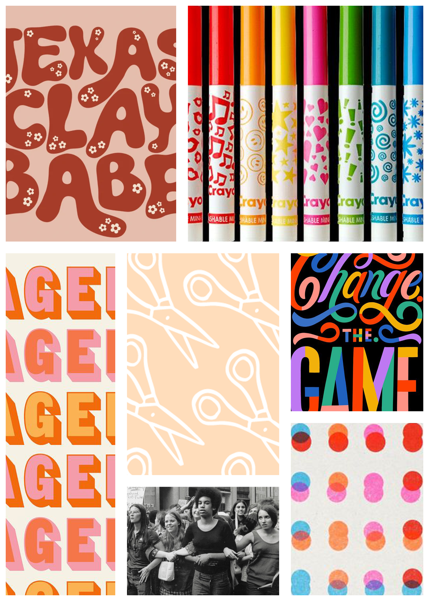
MOOD BOARD
VISION
We’re Here To Learn
That’s the biggest line I’m focused on while coming up with concepts for this branch of ALP.
Because we’ve done three other logos together within this world, I want this particular build out to stand firm as it’s own chapter, feeling like it belongs as a unit of ALP while having a distinct set of aesthetics that community members can feel is proudly their own.
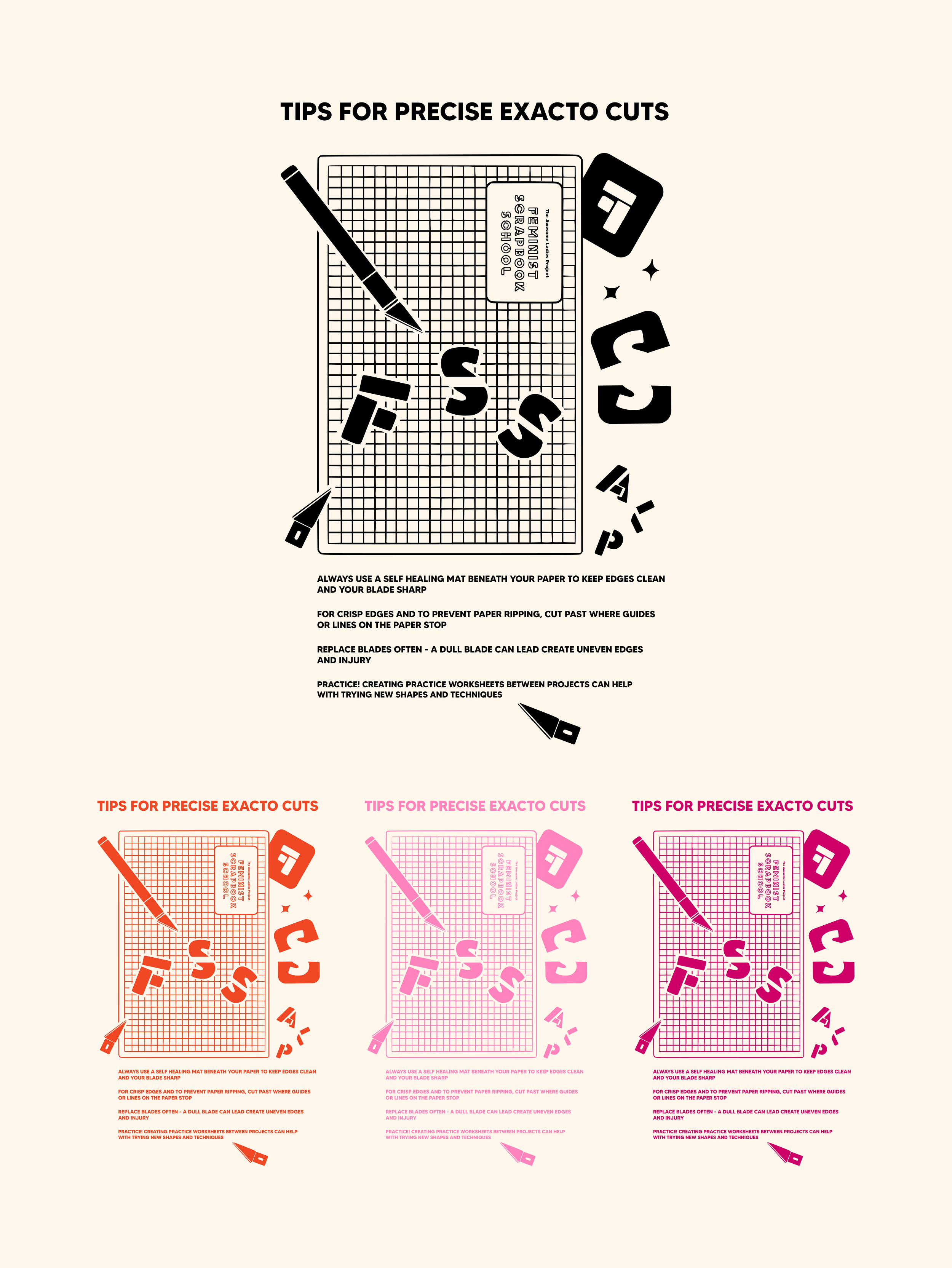
A big part of this distinction will be with the typeface itself and color palette. Using the ALP colors as the foundation, I would also like to play with incorporating one or two bold complimentary tones (like with CAFP and VSF). I envision the typeface being one that truly POPS - something along the lines of the original ALP typeface but dialed up with even more character and boldness.
For the artwork itself I want to do some sort of fun twists on images that have been frequently represented in the ALP brand, like scissors and pencils, but with their own spin uniquely FSS. Playing with texture and layering will be something fun to dive into here, as well as coming up with new imagery to further represent the community driven core of ALP.
EXPANDED ALPHABET


TSHIRT DESIGN
ROUND 1