HARPE STAR
Custom Logo Design
moodboard

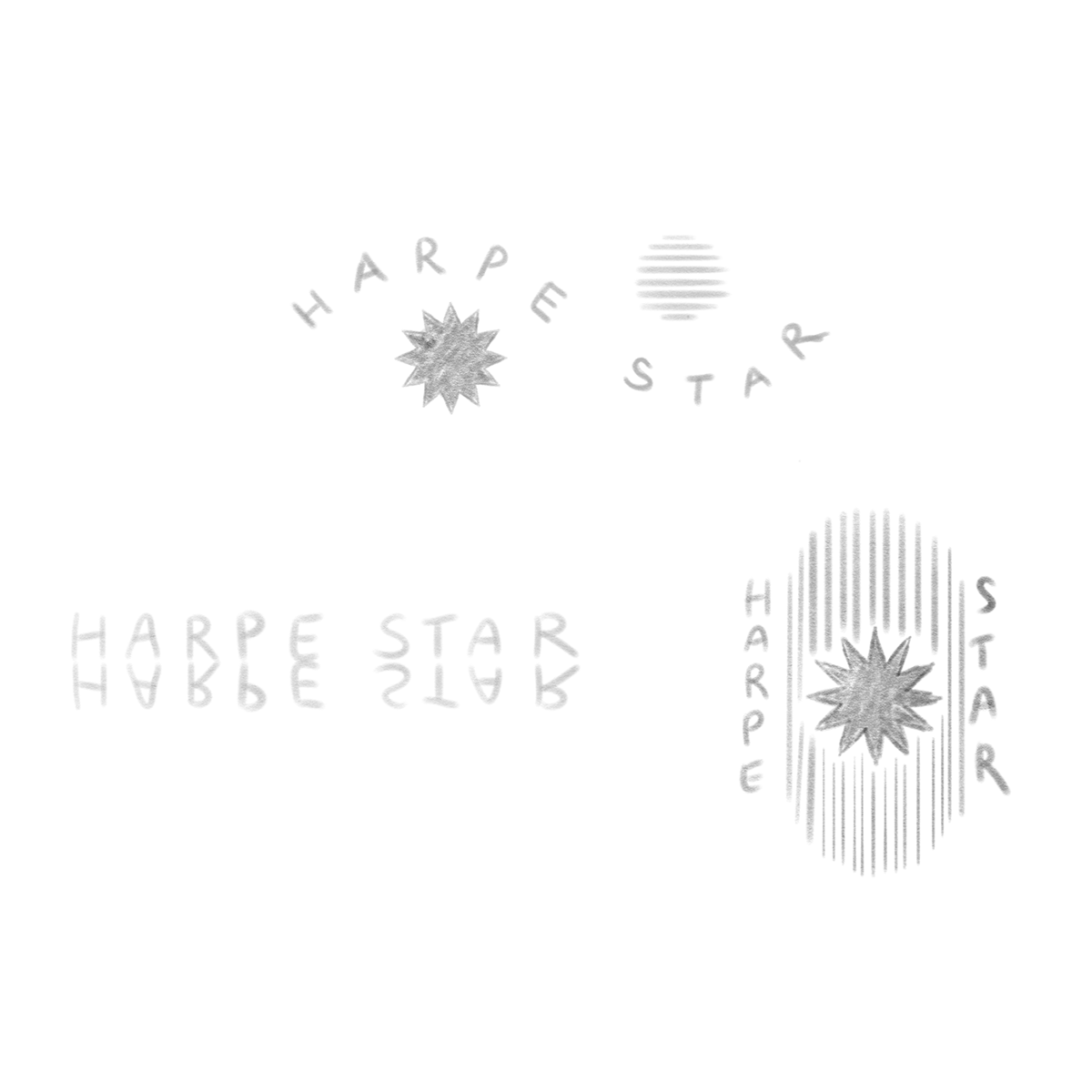
CONCEPT SKETCHES
CONCEPT 1
the window
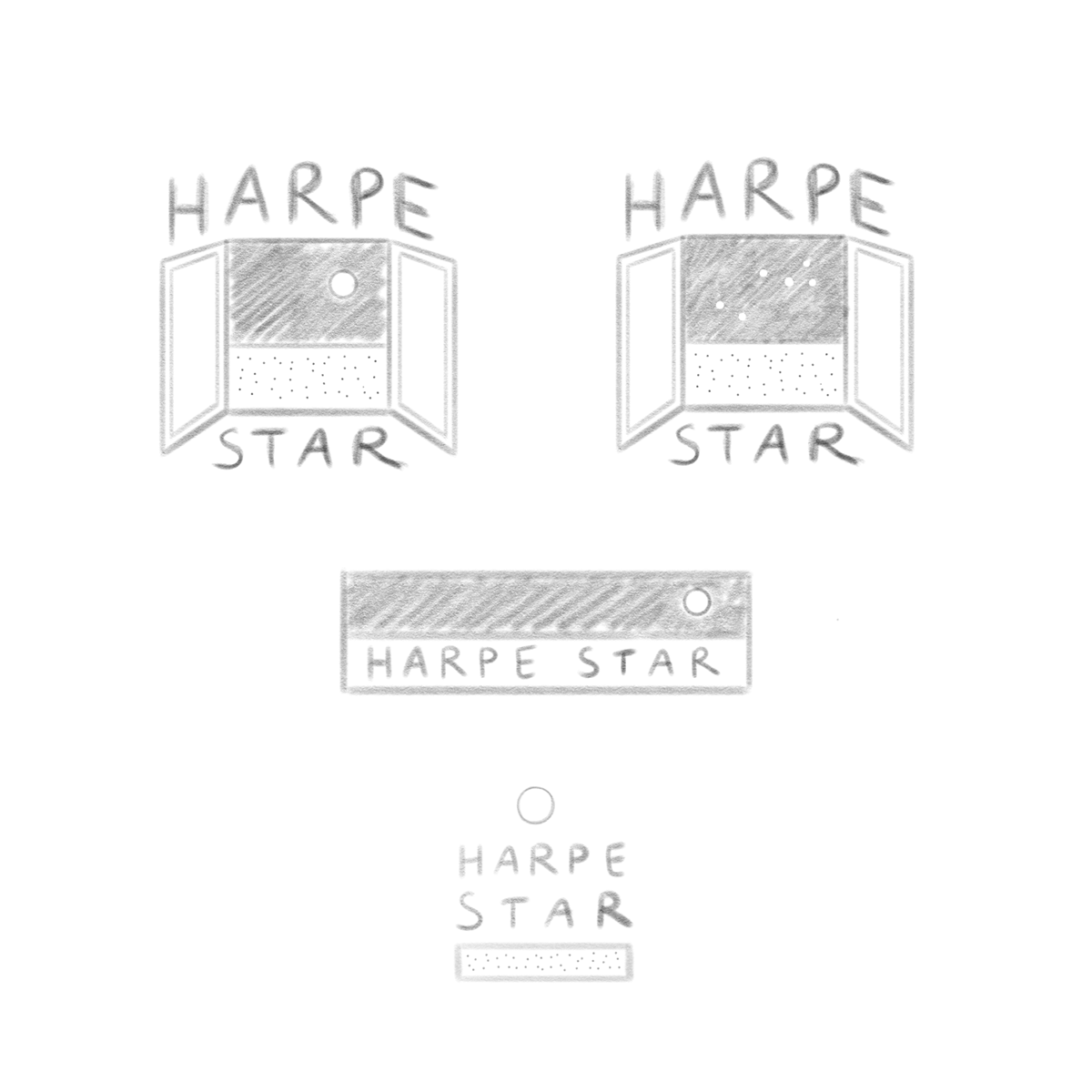
This concept is the most illustrative of the three, with the main core logo being an open night-time window looking out over a dark sky. The space reference here is focused on the night sky, with the option to have either a moon or the subtle lyra constellation in negative space against the dark.
Submarks would focus on typography and interesting contrast work, keeping the entire set minimal and open.
concept 1 inspiration:
CONCEPT 2
true stories from nature
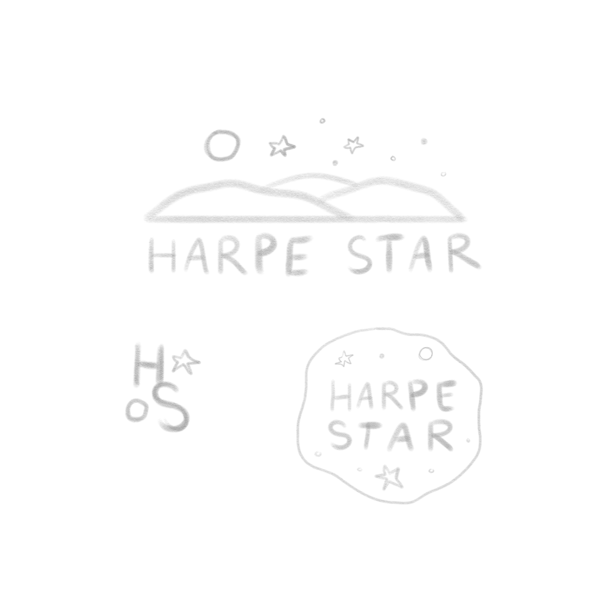
A very obvious nod to The Little Prince, if you look for it. This concept is also illustrative, with emphasis being on cruder line work, primarily with the stars and moon / planet shapes. This concept is meant to be super playful and light, while remaining minimal and focused.
Submarks would focus on fun arrangements of the typography, with small illustrations dotted within, creating a cohesive set.
concept 2 inspiration:
CONCEPT 3
GOOD TIME STAR SHINE
This is the most “modern” and minimal of the three, with the main focus being on the typography. Accompanying the bold type would be linework forward shapes that give the whole logo a very yin / yang feeling.
Definitely room here to get fun with the layout and combinations of shape and text, driving forward the modern tone of the designs as a whole.