
REV. ASH TEMIN
Custom Logo & Branding Design
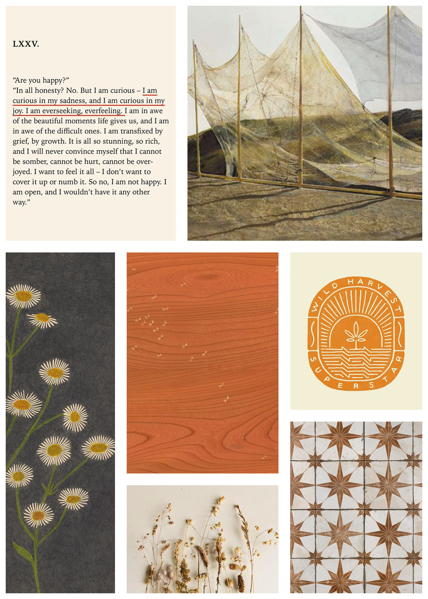
MOOD BOARD
VISION
My main focus with both the logo and branding is to create a very core feeling of compassion and healing within the design, with a focus on thoughtful composition and a lot of “breath” - not overcrowding the logo with too much stacked detail. or framework.
When it comes to the illustrations and applied aesthetic, I want to really lean into natural elements (including plants, water and stars) and balance gentle movement and shape with a typeface that is unique but versatile and practical.
Because the general aesthetic and message of the logo is so intentional, I wanted to make sure that the color palette not only reflects that - but solidifies and uplifts. I chose a vibrant Sienna as the main color focus, with soft complimentary colors like ivory and dusty sage. And instead of black, I chose a rich earthy brown and a faded twilight steel (Which is actually a really dark orange-grey, which makes it seamlessly flow with the other earth-tone shades) to use as the darker counterparts.
COLOR PALETTE

ROUGH SKETCHES
CONCEPT 1

Using a combination of a clear script (either a handwritten or custom constructed typeface) and the flow of botanicals, this concept is the most gentle and flowy of the three. The two plants that I sketched in the main logo are interpretations of lavender and mimosa, two symbolic and healing flowers. Small stars give the logo a sense of “place” and quiet levity, while also lending framing and body to the compositions.
CONCEPT 2
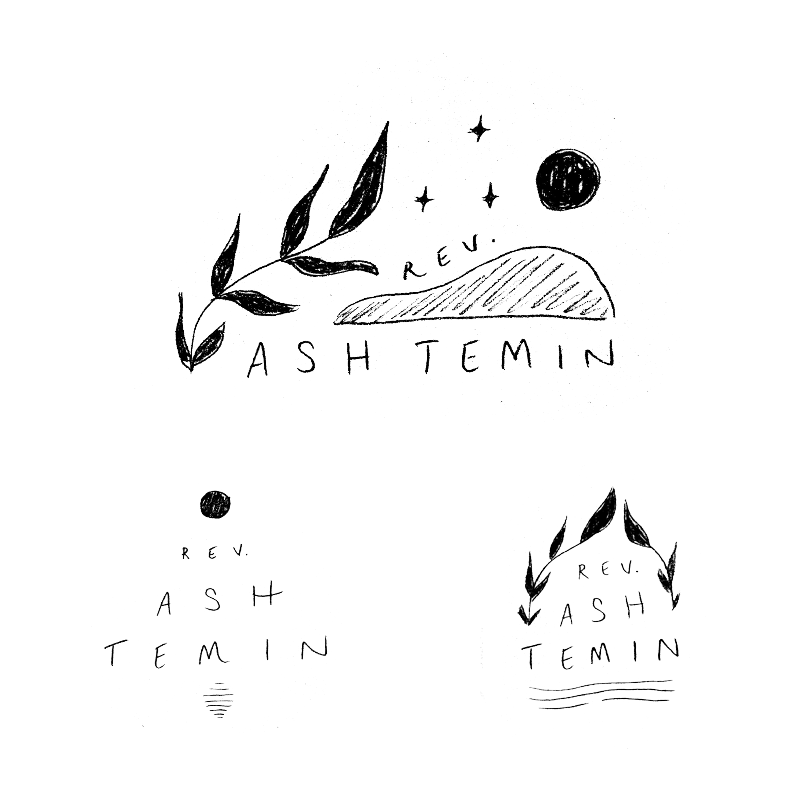
This concept uses bold yet simple illustrations to give the design a lot of balance, give and take, and strong aesthetic recall. I wanted to use the secondary logo and sub-marks as a way of expanding the little “world” that the main logo creates, with a less is more approach to the artwork. Also within the sub-marks I would love to explore the reflection concept more (like the sketch on the left side), expanding on the feeling of water, versus only explicitly illustrating water, if that makes sense?
CONCEPT 3

In every concept lineup I tend to include one sketch that is aesthetically quite different than the other two. This concept leans into art nouveau and retro stencil design inspirations, with clear linework and structured illustration. I used the healing calendula flower as reference for the core artwork, with it’s pattern being mimicked and re structured throughout the design.


